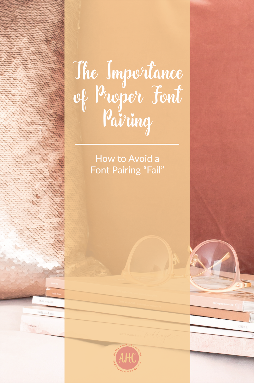
The Importance of Proper Font Pairing
How to Avoid a Font Pairing “Fail”
Proper font pairing can make or break a design or brand. When deciding on fonts for a branding project, it’s important for me to include two different fonts, as to ensure the brand can dynamically use the fonts provided.
So why the heck does it matter? Here are three points on the importance of proper font pairing and how to avoid a font pairing “fail”.
1. Contrast Makes It More Appealing and Easier for the Reader
When pairing fonts, it’s essential to pick two contrasting styles. Contrast means the fonts are sufficiently different in appearance.
Contrast is the entire reason designers pair fonts in the first place. Contrast in fonts makes the text of a website, print marketing material, or social media image more visually interesting and helps catch more attention.
Most importantly though, contrasting fonts can make it easier for the reader to differentiate between pieces of the text such as heading and body copy.
How to Avoid a Font Pairing Fail When It Comes to Contrast?
Pick one sans serif font and one serif font to create contrast. Make sure the fonts are easily legible and differentiate in a subtle, yet noticeable way.
2. Keeps Emotional Qualities in Line
Through proper font choice and pairing you are able to convey the correct message to the reader. If the fonts are unpleasant to look at, due to their mismatchment, you can easily convey the wrong message or emotion.
When looking at a font, the adjectives we use to describe the way the font “feels” can help pair fonts together. The feel is subjective, of course, but it is a very important factor in pairing fonts. Mixing incompatible fonts can derail your content or brand. For instance, you wouldn’t put a light and flowery font with a heavy sad looking font.
For example, see the below font pairings that simply do not match the overall feeling.

A proper font pairing will convey the right emotions and fit the “feels” together. See below proper font pairing for this subject.

How to Avoid a Font Pairing Fail When It Comes to Emotional Qualities?
Pinterest is a great tool to find the perfect font pairing. Simply type in your adjective + font pairing. *PRO TIP* Avoid overwhelm by hiring a designer who specializes in branding and font pairing.
3. Conveys Effort
Lastly, when you take the time to hire a professional designer to create a brand for you, the proper font pairing conveys effort on your part. Contrasting fonts that match the same emotion will convey your brand’s message in an effective way and will show your professionalism.
When you come correct, people take notice. It shows an effort on your part and that you’re serious about your brand. Taking the time to properly pair fonts will give you a leg up on your competition who doesn’t take the time to put together a proper brand.
How to Avoid a Font Pairing Fail?
Go with a pro, don’t risk looking unprofessional.
So what are your thoughts on proper font pairing? Do you have any of your own tricks or tools you use to find a proper font match? Please leave your feedback in the comments below and let me know if you’d like my next blog to be a collection of free font pairings! 😉
© AMANDA HURLEY CREATIVE
PRIVACY POLICY
© AMANDA HURLEY CREATIVE | PRIVACY POLICY